Bruce Wayne, acted by Christian Bale on BATMAN BEGIN
Bruce Wayne ..... Who is he? Does he sound something for you? Yes? No? Mostly all of you know who he is. A young multi-billionaire (not in real life) who can buy almost everything, surrounded by pretty girls (if he wants to), has cars and other attributes for his kind of people, and become a legendary BATMAN when the crime terror the Gotham city. So, what is the relation between Bruce Wayne, Batman, and branding? Well, let's talk about it =D
Bruce Wayne was an ordinary boy who was born in a multi-billionaire family that live in Gotham city, a city that is full of crime. When he was a child, both his parents were murdered and he saw it by himself. Since that, the little Bruce had his own point of view about crimes.
 One scene at BATMAN BEGIN when Bruce's parents were murdered
When Bruce was an adult, he had his own journey to learn and find out the way to fight through martial arts. He left all his glamorous life for several years before came back to Gotham city with the new mission which was fighting the crime. This was the birth of a BATMAN.
 One scene at BATMAN BEGIN when Bruce
had his journey to learn martial arts
On the way back to Gotham city, his best assistant Alfred pick him up by his personal jet-plane. At the flight, they had a conversation about Gotham's latest situation. Related to the branding, Bruce Wayne did say something about branding on the conversation with Alfred. What was it? Please check on the following video....
The birth of BATMAN
Where is the branding statement there? Do you find them?
On the chat, Bruce Wayne said something to against the crime :
On the chat, Bruce Wayne said something to against the crime :
“… criminals will not be afraid on me if I am Bruce Wayne. I need something, a symbol, that is everlasting and will be feared by them …”
In branding, it means :
“… they will not remember me if I am Bruce Wayne. I need something, a symbol, that is everlasting and will be remembered by them …”
After he realized that he needed a symbol, then he prepared everything that he need to make the symbol alive which we know it as a BATMAN. The preparation was in everything from how the costume is, the color, the weapon / tools, the way he show up, the voice, the way he act, bat-light facility to call him, and many more. Through all this attributes, the BATMAN was success to frighten the Gotham city's crime and made him as an icon of Gotham's hero. And the citizen was easily remember what BATMAN is than a man named Bruce Wayne.
 Bruce Wayne became a BATMAN
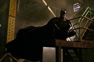 BATMAN on his costume
 BATMAN always showed up at night through extra ordinary ways
 BATMAN educated Gotham city how to call him
if anything bad is happened, by providing the bat-light
 BAT-MOBILE, one of BATMAN attribute
 Even Bruce Wayne was a BATMAN, people were easier to recognized
And all the attributes of BATMAN which has been mentioned before was mixed become a symbol (we call it logo). The symbol was not just a symbol. But it's more than that. It's a memorable and strong symbol that represented the whole things about BATMAN.
 BATMAN logo which represent the whole attributes of BATMAN
This is a logo used for. It's a symbol that represent a brand and all its related attributes. On this illustration, BATMAN is a brand which has some supporting attributes such as color, the weapon / tools, costume, extra ordinary ways of action, unique voice, hi-tech facility, strong and tough guy, and many more. For sure, not many people can remember all his attributes. But, by having a symbol / logo, it becomes easier to remember and describe what BATMAN is. Even visually, a logo consists of graphic ornaments (line, shape, etc), it has a deeper meaning and function, which we can say as a trigger for everyone to remember a brand.
So, how is your brand's logo? Is it easily recognized and memorable by your audience? Does it well represent your brand?
Well, we hope this brand discussion gives you some new information about the function of a logo. We are welcoming everyone who wants to share their opinion about it, even it's disagree one. Let's keep sharing. CHEERS =D
Regards,
CAVLENT's team
 Bruce Wayne became a BATMAN
 BATMAN on his costume
 BATMAN always showed up at night through extra ordinary ways
 BATMAN educated Gotham city how to call him
if anything bad is happened, by providing the bat-light
 BAT-MOBILE, one of BATMAN attribute
 Even Bruce Wayne was a BATMAN, people were easier to recognized
BATMAN than himself because BATMAN was a symbol
And all the attributes of BATMAN which has been mentioned before was mixed become a symbol (we call it logo). The symbol was not just a symbol. But it's more than that. It's a memorable and strong symbol that represented the whole things about BATMAN.
 BATMAN logo which represent the whole attributes of BATMAN
This is a logo used for. It's a symbol that represent a brand and all its related attributes. On this illustration, BATMAN is a brand which has some supporting attributes such as color, the weapon / tools, costume, extra ordinary ways of action, unique voice, hi-tech facility, strong and tough guy, and many more. For sure, not many people can remember all his attributes. But, by having a symbol / logo, it becomes easier to remember and describe what BATMAN is. Even visually, a logo consists of graphic ornaments (line, shape, etc), it has a deeper meaning and function, which we can say as a trigger for everyone to remember a brand.
So, how is your brand's logo? Is it easily recognized and memorable by your audience? Does it well represent your brand?
Well, we hope this brand discussion gives you some new information about the function of a logo. We are welcoming everyone who wants to share their opinion about it, even it's disagree one. Let's keep sharing. CHEERS =D
Regards,
CAVLENT's team